Interactive & Multisensory Interpretations of Historical Embroidered Naval Patches
In Amy Hurst & Anita Perr’s Spring 2022 class “Access and Assistive Technology in Museums and HIstorical Sites,” I worked with classmates to consider methods of interpreting historical naval patches from the collection of the Intrepid Air and Space Museum. The patches are unique, fragile, and rarely displayed. When they are part of an exhibition, they are behind glass. Currently, the majority of the patches are only available for viewing on the museum’s website.
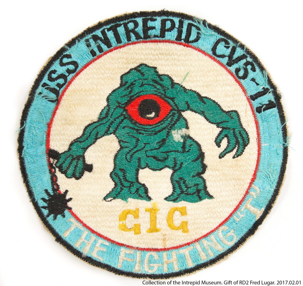
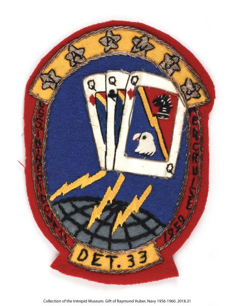
Beginning with simple microcapsule graphics, we simplified the images and created raised-line graphic representations. We then explored methods of expanding these interpretations beyond simple tactile descriptions of their form. We wondered how we could also incorporate information about materials, historical context, and fabrication techniques. With microcapsule graphics as our base, we added electronics, speakers, and conductive threads to interpretations of two patches. When the sound was triggered by touch, a narrative would play, telling the story behind each patch.
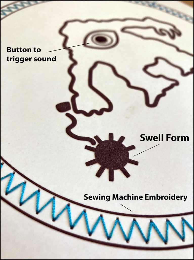
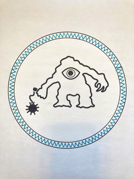
While we were exploring creating multisensory interpretations of the patches, I also experimented with embroidery. I wanted to connect the interpretations back to their original medium.
First iterations explored ideas of embroidery as microcapsule, creating raised line graphics with dense satin stitches on fabric.
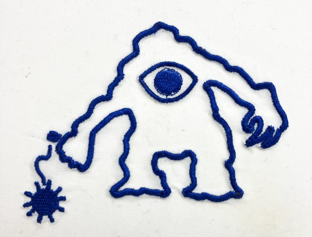
This finding informed the next iteration of research and prototyping in December of 2022.
Developing a Digital Embroidery Lexicon for Tactile Graphics
After observations at the Intrepid Museum and feedback from Blind/low-vision user/experts, I decided to focus on incorporating more embroidery into interpretations of the naval patches.
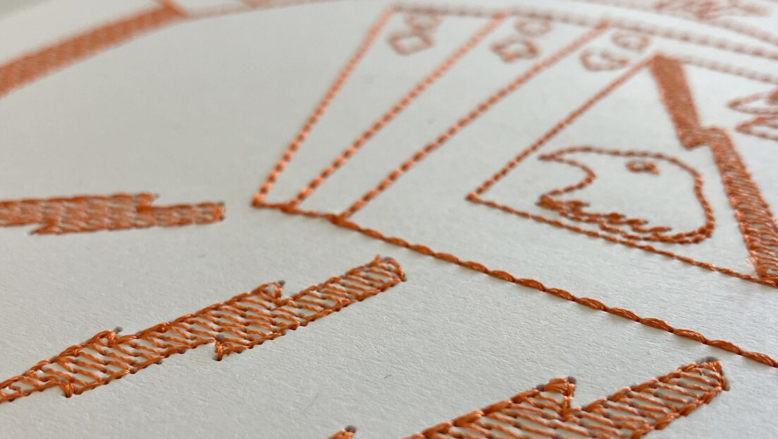
In partnership with Blind and low vision tactile graphics experts, I developed a line and pattern lexicon to be used for creating tactile interpretations of historical textiles with digital embroidery. Guidelines from the book Art Beyond Sight were used as a starting point. Our goal was to develop a method for creating tactile graphics that were digital, low-cost, and easily reproducible by Art Museums and Historical Sites, while making connections back to the artifacts’ original materials. We decided to work with paper, as opposed to fabric. This choice was made because of ease of sourcing materials and cost, but also to leave open the possibility to combine embroidery and microcapsule for layered and more varied tactile graphics.
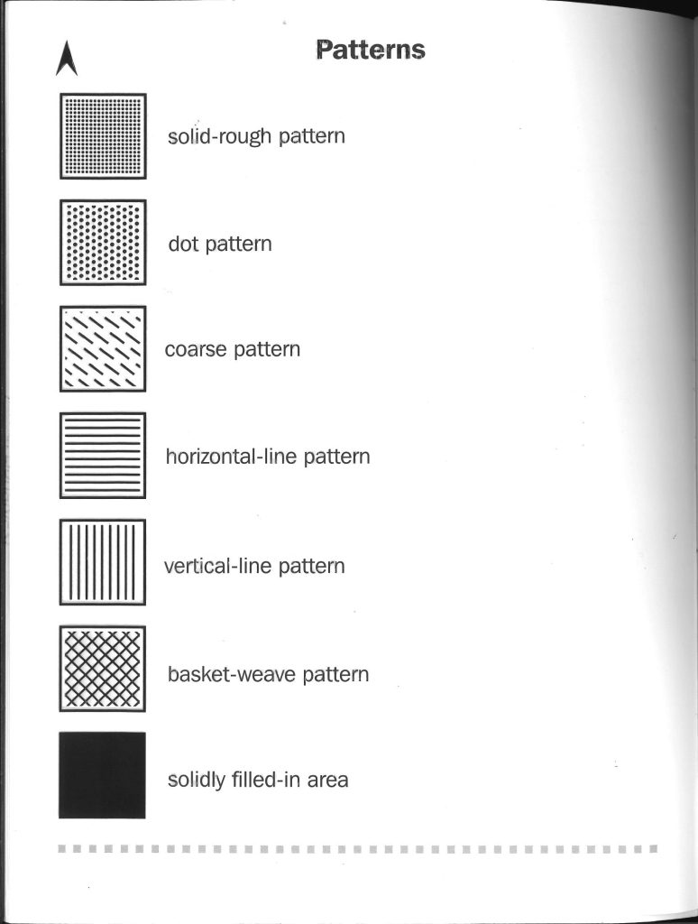
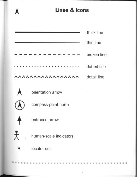
Pattern samples were created and evaluated by BLV user/experts. Additionally, various papers were tested for ease of stitching and durability. Cardstock (black and white), Yupo, Vellum, and Watercolor paper were all tested. We also evaluated thread types, including cotton, rayon, and polyester.
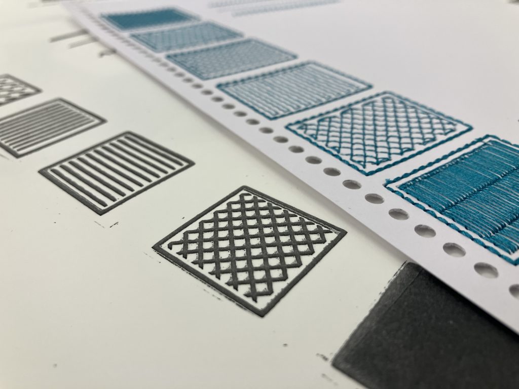
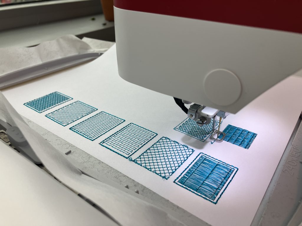
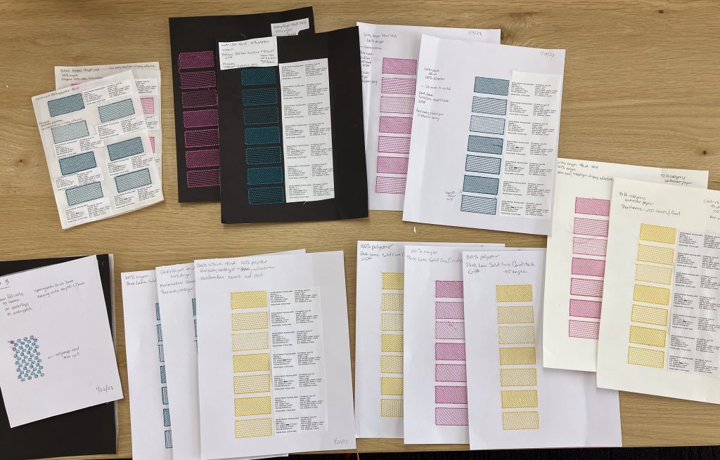
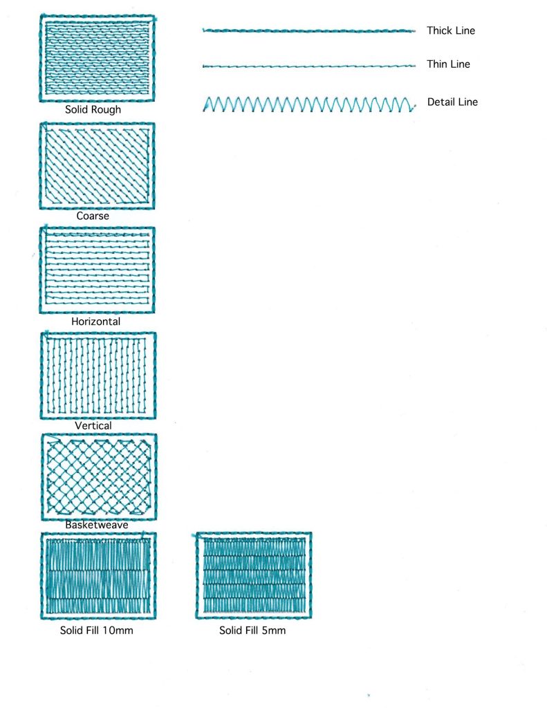
With tactilely legible patterns established, we created two tactile graphics based on images intended for microcapsule from the ABS book.
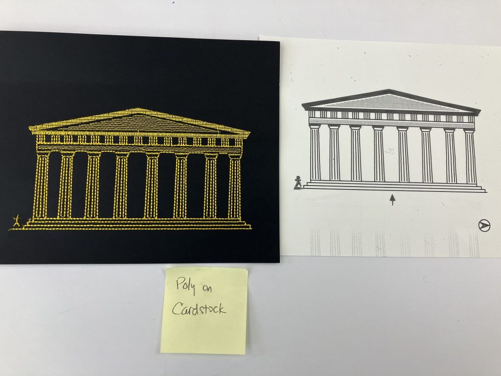
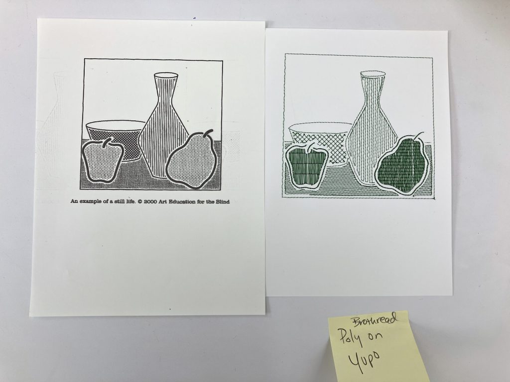
Evaluations by BLV tactile graphics experts helped determine which stitches and patterns were both effective and pleasing to touch.
I then revisited the original naval patches and created interpretations using the lexicon we created.
Applying Evaluated Patterns and Lines to Interpretations of Historical Textiles
Based on explorations and feedback, we applied our techniques to two historical patches. We made both with polyester thread and 65lb. cardstock with the CIC patch taking 30 minutes to produce and the Mediterranean Cruise patch taking 50 minutes.
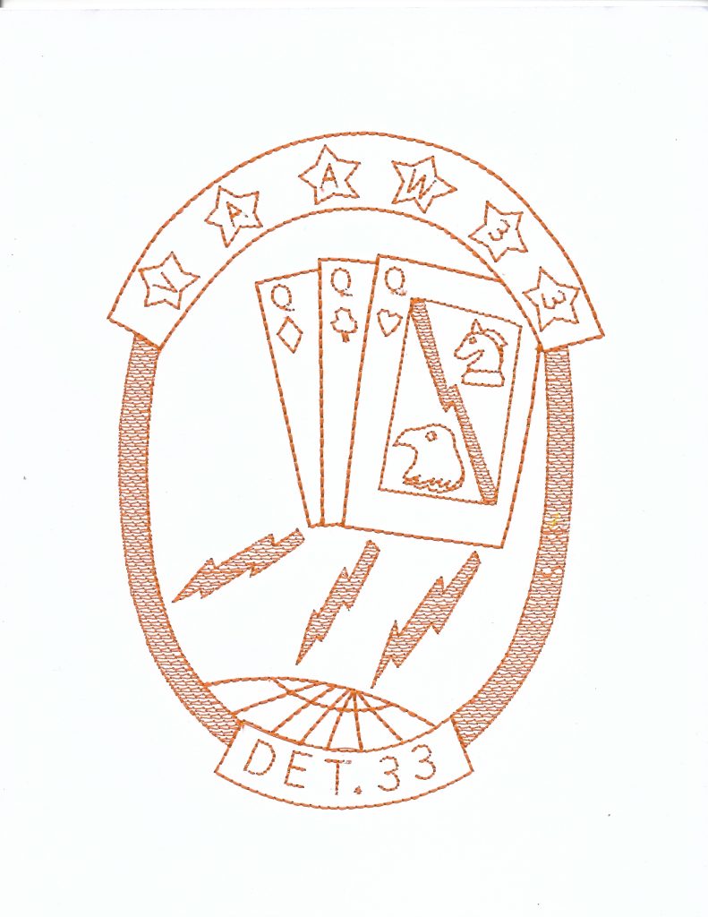
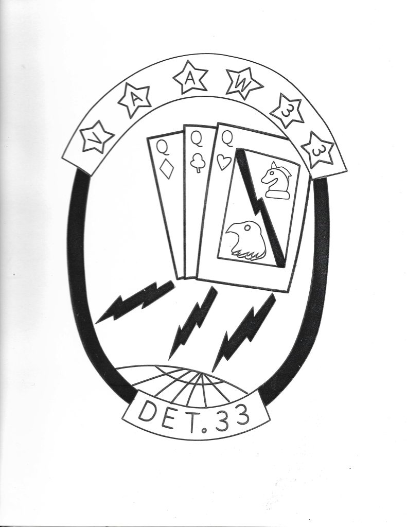
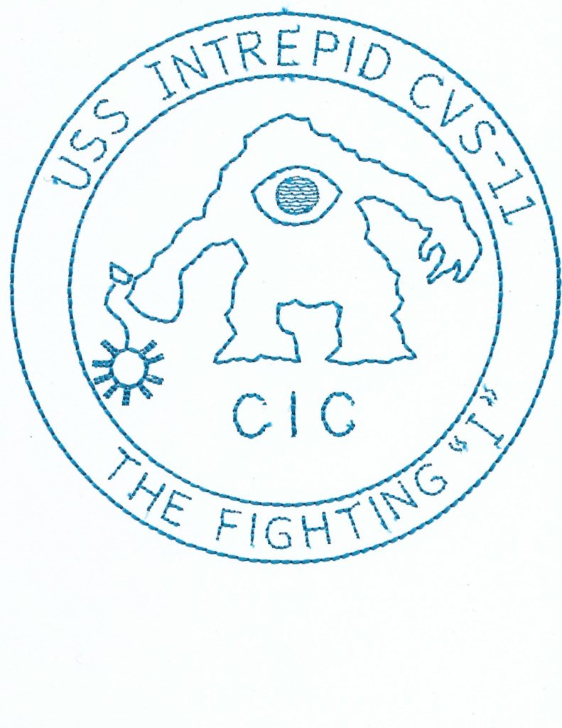

We evaluated these prototypes with tactile graphics experts (TGEs) with microcapsule printed versions as comparisons. TGE1 felt that the CIC patch was legible, and that the eye of the monster was well-defined. The playing cards on the Mediterranean Cruise patch were “enjoyable” to touch, and using the Solid Rough fill made the shapes discernible. TGE2 commented that the Solid Rough texture “felt like cloth.” TGE2 felt that, compared to the microcapsule versions, the embroidery provided greater detail and enjoyed the “rhythm” that the stitches created. Not all experts were able to read the letters and said they were “bumpy” reminding them of Braille (TGE1) and felt “almost pixelated” (TGE3). Letters that followed a curve were difficult to discern for TGE1 compared to letters on a straight horizontal path. Despite having difficulty reading the letters TGE1 felt they should be kept, as they provided context and were closer to a true representation of the original artifact. TGE1 felt that most of the main elements discernible, and lost details could be described with explanatory text or a key, as tactile graphics usually are.
Discussion and Guidelines for Aesthetic Touch
When working with historical museum objects, it is important to discuss with curators how to balance historical accuracy with tactile legibility. We follow tactile graphic design best practices [7], such as providing 0.25 inch breathing room between elements, and not overlapping design elements, and never using more than four patterns. We used Hershey Fonts to produce clear letters that stitch well with a 3mm stitch distance and reducing to 2mm for curvy or precise lettering. However, small lettering and details are difficult to make legible. We recognize the limited capacity for museum staff to produce tactile graphics and recommend Yupo paper for its durability and ability to be cleaned, but 65 lb. cardstock is a good low-cost alternative. We recommend pre-cut and self-adhesive thin stabilizer with 40 wt. rayon thread or polyester thread and running the embroidery machine at a slower speed than with fabric to minimize tearing.
As future work, we will evaluate the durability and usability of our embroidered tactile interpretations with museum visitors with a range of vision abilities and apply our heuristics to other artifacts. We are also interested in making the design and fabrication tools accessible to our tactile graphics experts so they can be involved more deeply in the design process.
